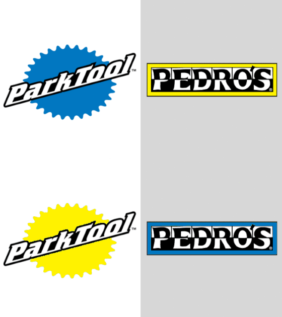
We decided to try a little fun visual experiment AND test out our graphic design skills at the same time... We took some of cycling's biggest and well known brands and swapped the color schemes with one of their competitors. I know it doesn't seem like it would be much, but once seeing the logo that you've known and loved for so long in someone else's clothes, it is a little unsettling AND mesmerizing at the same time. It's funny how we associate certain colors to particular companies and when what we know changes, it can just seem awkward and strange. At the same time, it took us a second to realize which logo was the original... Anyways, we thought it was a little bit of a trip and fun to play a trick our brains. Lastly, I know our company isn't exactly a big, well known, or famous brand in the cycling industry(VERY VERY far from it) but since it is our list and all, we get to and had to include it. Plus it was fun to swap colors to see how our logo could look...


Write a comment